03
03
03
Bombay by Chaat House
Bombay by Chaat House
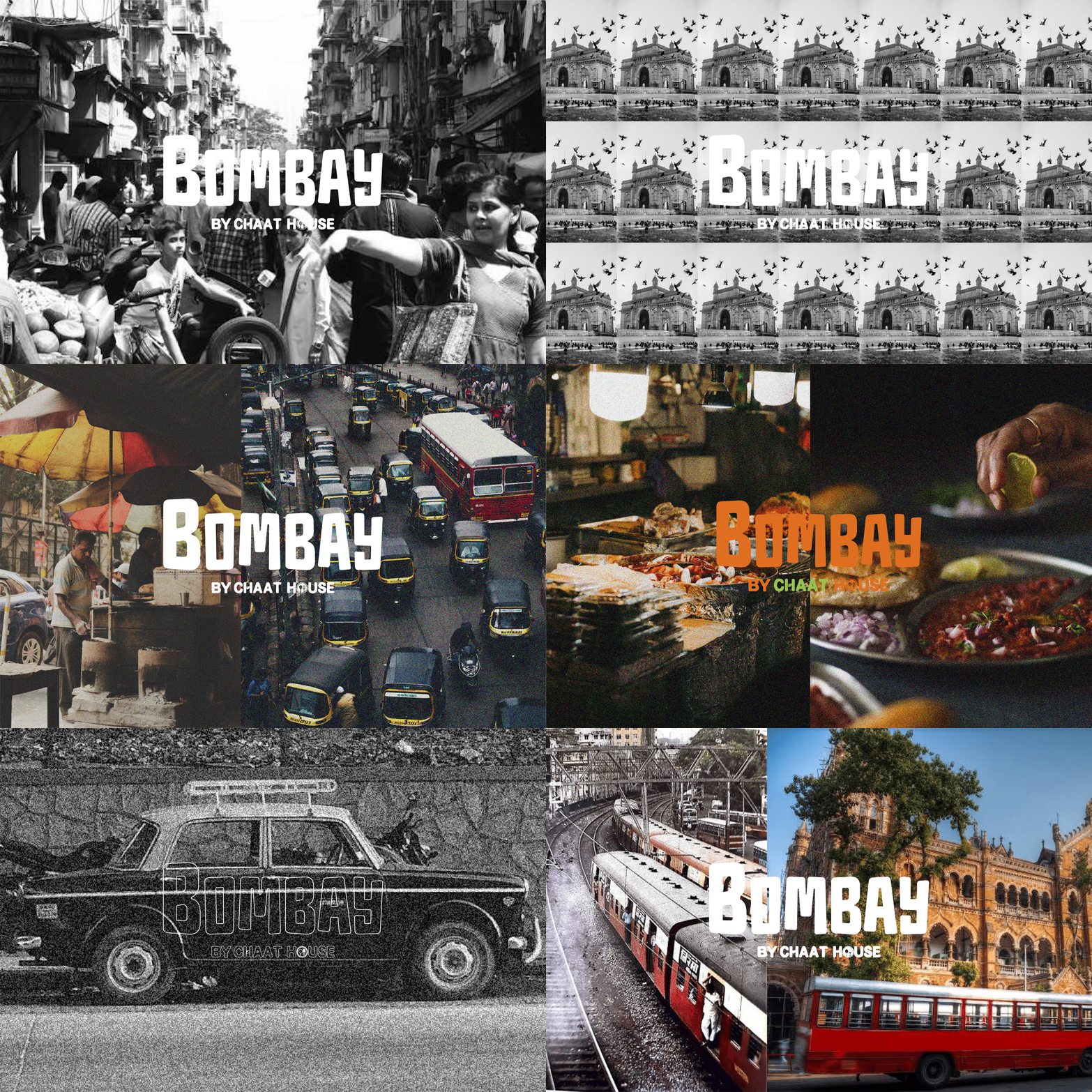
Bombay by Chaat House is an Indian street-food concept in Seattle, created around the energy, familiarity and colour of everyday Bombay. The project brought the brand to life across identity, interiors and social media, building a visual language that could move naturally from a storefront sign to a dining space to a digital campaign.
Scope
Bombay by Chaat House is an Indian street-food concept in Seattle, created around the energy, familiarity and colour of everyday Bombay. The project brought the brand to life across identity, interiors and social media, building a visual language that could move naturally from a storefront sign to a dining space to a digital campaign.
Scope
role →
role →
Brand Identity, Interior Design & Social Media campaign
Brand Identity, Interior Design & Social Media campaign
year →
year →
2025
2025
The Idea
The Idea
The Idea
Rather than leaning into traditional representations of Indian dining, Bombay was designed to feel young, energetic and immediately approachable.
The visual direction takes cues from the colour, typography and graphic character of Indian street culture, then simplifies them into a contemporary identity suited to Seattle.
Warm orange became the dominant brand colour, balanced by fresh green, cream and natural timber. Across every touchpoint, the aim was to create something playful and nostalgic without becoming overly decorative.
Rather than leaning into traditional representations of Indian dining, Bombay was designed to feel young, energetic and immediately approachable.
The visual direction takes cues from the colour, typography and graphic character of Indian street culture, then simplifies them into a contemporary identity suited to Seattle.
Warm orange became the dominant brand colour, balanced by fresh green, cream and natural timber. Across every touchpoint, the aim was to create something playful and nostalgic without becoming overly decorative.


interior design
Visual Language
Visual Language
Visual Language
The supporting graphic system takes cues from vintage food advertisements and printed ephemera.
Radiating backgrounds, bold typography, oversized food imagery and lightly textured surfaces give the communication a familiar, almost poster-like quality—creating a bridge between nostalgia and a contemporary fast-casual brand.
The supporting graphic system takes cues from vintage food advertisements and printed ephemera.
Radiating backgrounds, bold typography, oversized food imagery and lightly textured surfaces give the communication a familiar, almost poster-like quality—creating a bridge between nostalgia and a contemporary fast-casual brand.
Colour
Colour
Colour
A concentrated palette of orange, green and warm cream carries the identity.
Orange gives the brand its energy and becomes the dominant visual cue across the restaurant. Green introduces contrast and references the freshness and colour associated with Indian street food, while cream softens the system and gives digital applications a warmer, more tactile character.
A concentrated palette of orange, green and warm cream carries the identity.
Orange gives the brand its energy and becomes the dominant visual cue across the restaurant. Green introduces contrast and references the freshness and colour associated with Indian street food, while cream softens the system and gives digital applications a warmer, more tactile character.
interior design

The identity becomes architecture.
The identity becomes architecture.
Rather than treating the interior as a separate exercise, the spatial concept was developed as an extension of the brand itself. Bombay's orange moves beyond graphics and becomes an architectural element—wrapping walls, beams and ceiling features to create a strong visual rhythm throughout the restaurant.
Curved ceiling bands soften the existing geometry of the space and introduce movement overhead, while a repeated series of globe lights creates a recognisable lighting language.
Against this, cream surfaces and natural timber furniture keep the dining space warm and accessible.
The result is deliberately graphic: large areas of colour, simple geometries and repeated forms allow the interior to feel like stepping directly inside the brand identity.
Rather than treating the interior as a separate exercise, the spatial concept was developed as an extension of the brand itself. Bombay's orange moves beyond graphics and becomes an architectural element—wrapping walls, beams and ceiling features to create a strong visual rhythm throughout the restaurant.
Curved ceiling bands soften the existing geometry of the space and introduce movement overhead, while a repeated series of globe lights creates a recognisable lighting language.
Against this, cream surfaces and natural timber furniture keep the dining space warm and accessible.
The result is deliberately graphic: large areas of colour, simple geometries and repeated forms allow the interior to feel like stepping directly inside the brand identity.


A Recognisable Ceiling Language
A Recognisable Ceiling Language
One of the defining elements of the restaurant is the orange ceiling installation.
Large curved bands sweep across the dining area, creating a visual path through the space while framing clusters of pendant lights.
Elsewhere, circular ceiling forms repeat the geometry of the lighting fixtures, building a consistent rhythm overhead.
These interventions create impact without overcrowding the restaurant, using a small number of strong gestures rather than excessive decoration.
One of the defining elements of the restaurant is the orange ceiling installation.
Large curved bands sweep across the dining area, creating a visual path through the space while framing clusters of pendant lights.
Elsewhere, circular ceiling forms repeat the geometry of the lighting fixtures, building a consistent rhythm overhead.
These interventions create impact without overcrowding the restaurant, using a small number of strong gestures rather than excessive decoration.

